Использование мета тега viewport в адаптивных шаблонах. Что такое Viewport, как он работает и для чего вообще нужен. Добавление meta viewport к веб-странице
Мета тег HTML определяет информацию о веб странице. Теги группы meta называют мета тегами, а содержимое мета тега - метаданными. Метаданные указывают различную техническую информацию о документе, в основном для браузеров и поисковых систем и не видны пользователю на сайте.
Часто используются meta-теги: author , description , keywords , viewport , charset .
Мета теги находятся в области
HTML документа (). Вставить или, как говорят, прописать мета теги можно в любом порядке и количестве.Использовать meta теги не обязательно, но мы рекомендуем заполнять хотя бы мета теги description , viewport , charset . Это будет плюсом для внутренней оптимизации сайта.
Синтаксис
Примеры использования в HTML коде
Основные мета теги
Ниже приведены несколько основных тегов с комментариями по применению и примерами использования.
Meta-тег description
Краткое описание документа (страницы сайта). Поисковые системы могут использовать содержимое мета тега description для вывода в сниппете поисковой выдачи.
Пример использования мета тега description
Meta-тег keywords
Ключевые слова страницы. Ранее использовался для указания поисковым системам основные смысловые фразы веб-страницы. На данный момент существуют разные мнения как правильно и стоит ли заполнять мета тег keywords .
Пример заполнения мета тега keywords
Meta-тег viewport
Задает некоторые параметры окна просмотра в браузере. Атрибут width указывает ширину окна просмотра (вьюпорта), initial-scale - коэффициент масштабирования при первом открытии страницы.
Пример использования мета тега viewport
Мета тег для адаптивного сайта: указывает, что ширина вьюпорта подгоняется под размеры устройства:
Meta-тег charset
Кодировка веб страницы. Наиболее частое значение: "UTF-8".
Пример использования мета тега кодировки charset
Meta тег refresh
Мета тег с атрибутом указывает время автоматического обновления страницы. Страница будет автоматически перезагружаться с интервалом указанным в content атрибуте. Значение указывается в секундах.
Пример использования meta http refresh
Поддержка браузерами
| Тег | |||||
| Да | Да | Да | Да | Да |
Атрибуты
| Атрибут | Значения | Описание |
|---|---|---|
| charset |
character_set |
Указывает кодировку HTML документа. |
| content |
тестовое значение |
Основное содержимое мета тега. Зависит от других атрибутов. Используется вместе с http-equiv или name . |
| http-equiv |
content-type |
Устанавливает HTTP заголовок для атрибута content . Сontent-type
- Кодировка. Устаревшее значение, в HTML5 используйте charset
(см. пример выше). |
| name |
application-name |
Имя мета тега. Как и http-equiv определяет суть мета тега. Application-name
- имя веб приложения, которое представляет страница. |
Привет всем и сегодня мы поговорим о том, что такое viewport и как его использовать.
Для того, чтобы понять, что это такое, вам нужно какое-нибудь мобильное устройство. Теперь давайте создадим простую html страничку такого содержания:
test post
this is a test post
another post
this is pretty cool
New Post
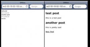
Теперь откроем нашу страницу на мобильном устройстве и что мы увидим? А увидим мы, что текст слишком маленький и читать его сложно. Однако, если мы добавим тег следующего содержания в тег head
То теперь текст выглядит нормально. Вот рисунок. Слева без тега , а справа с ним

Почему же так происходит? Дело в том, что браузер по-умолчанию думает, что сайт сделан для десктопной версии браузера и пытается полностью вместить его в окно вашего смартфона. Задав же тег , мы говорим браузеру телефона, что ширина просмотра равна ширине смартфона. Вот такой простой тег, но он очень помогает при создании мобильной версии сайта.
Также можно задать масштаб. Для этого используется inital-scale
Если вы хотите запретить пользователю изменять масштаб страницы на его смартфоне, то можете прописать следующее:
Но нужно быть аккуратным, т.к. бывает, что текст достаточно трудно прочитать и приходится его увеличивать, но если это будет запрещено, то вы доставите неудобства пользователю.
Поддержка браузерами
Android поддерживает, но до версии 2.2 . начальный масштаб равен 1.0
Symbian, Nokia 40 серии, Motorola, Opera mobile/mini и NetFront не поддерживают
IE поддерживает с 6 версии
BlackBerry поддерживает с версии 4.2.1
Как вы можете видеть, поддержка пока что неполная, но вы уже можете использовать этот тег, т.к. большинство новых смартфонов уже его понимают.
Итак, на этом я заканчиваю эту статью, спасибо за внимание.
Так уж сложилось, что мобильные браузеры появились сравнительно недавно, а сайтов в сети к тому времени уже было огромное количество. Естественно, все эти сайты совсем не были оптимизированы под маленькие экраны смартфонов, а смартфоны в свою очередь, вынуждены были полагать, что все сайты в ширину занимают где-то около 1000px (980px в сафари). Нужно было как-то решать сложившуюся ситуацию и в apple придумали метатег , который по традиции потом сперли все остальные производители браузеров.
Давайте рассмотрим типично-эпичную верстку сайта:
html
Hello world
Откроем его в мобильном браузере. Вот что мы увидим:
Как вы правильно заметили, текст слишком мелкий и произошло это потому, что сафари попытался вместить наш сайт (который по его предположению сделан для браузеров с шириной экрана около 980pх)
Давайте теперь сообщим браузеру, что наш сайт адаптирован для любой ширины экрана.
html
Что получилось:

Ну вот, теперь все намного лучше. Обозначив width=device-width , мы сказали браузеру, что нам нужна область просмотра контента, равная ширине экрана мобильного устройства.
Можно вручную задать значение для width. Например content="width=320px" , но этого не рекомендуется делать, потому-что различные смартфоны могут иметь абсолютно различную ширину экрана.
Очень распространенным вариантом является:
html
такой вариант задает ширину страницы и начальный масштаб (в данном случае без масштабирования)
Также часто используется следующий вариант:
html
Такие значения используют в случае, если сайт будет использоваться и функционировать как мобильное приложение. Т.е
- при загрузке страницы она не будет смасштабирована
- страница займет всю ширину мобильного браузера
- запрещено любое пользовательское масштабирование
- доступен только горизонтальный и вертикальный скролл
Используйте эту конфигурцию, только в том случае, если знаете, что делаете.
Давайте разберем допустимые параметры и их значения, доступные в мета теге viewport
width
Целое число (от 200px - 10,000px) или “device-width”.
Задает ширину viewport. Если нирина viewport не указана, то:
- для мобильного Safari это 980px
- Opera - 850px
- Android WebKit - 800px
- IE - 974px
height
Целое число (от 223px до 10,000px) или “device-height”
задает высоту viewport. 99% случаев, просто не обращайте внимания на этот параметр, но если сильно надо – пробуйте и экспериментируйте. Удачи..
initial-scale
1.0 - не масштабировать. Задает масштаб страницы. Увеличиваем значение – увеличиваем масштаб.
user-scalable
Доступные значения no или yes
Задает возможнось изменения масштаба страницы. По-умолчанию установлено как yes в Safari.
minimum-scale и maximum-scale
Доступные значения (от 0.1 до 10).
1.0 - не масштабировать. Определяет минимальный и максимальный масштаб viewport соответственно.
По-умолчанию в мобильном Safari minimum-scale = "0.25" , maximum-scale = “1.6”.
Совет: Не используйте мета-теги (в том числе и этот), пока не разобрались, зачем все это нужно. И тестируйте все в различных мобильных браузерах. Удачи!
Can’t make the #ChromeDevSummit this year? Catch all the content (and more!) on the livestream, or join your peers for a CDS Extended event at a hosted location nearby. To learn more, check out the Chrome Dev Summit 2019 website .
Responsive Web Design Basics
Pete is a Developer Advocate
The use of mobile devices to surf the web is growing at an astronomical pace, but unfortunately much of the web isn"t optimized for those mobile devices. Mobile devices are often constrained by display size and require a different approach to how content is laid out on the screen.
A multitude of different screen sizes exist across phones, "phablets," tablets, desktops, game consoles, TVs, and even wearables. Screen sizes are always changing, so it"s important that your site can adapt to any screen size, today or in the future.
Set the viewport
Pages optimized for a variety of devices must include a meta viewport tag in the head of the document. A meta viewport tag gives the browser instructions on how to control the page"s dimensions and scaling.
TL;DR
- Use the meta viewport tag to control the width and scaling of the browser"s viewport.
- Include width=device-width to match the screen"s width in device-independent pixels.
- Include initial-scale=1 to establish a 1:1 relationship between CSS pixels and device-independent pixels.
- Ensure your page is accessible by not disabling user scaling.
To attempt to provide the best experience, mobile browsers render the page at a desktop screen width (usually about 980px, though this varies across devices), and then try to make the content look better by increasing font sizes and scaling the content to fit the screen. This means that font sizes may appear inconsistent to users, who may have to double-tap or pinch-to-zoom in order to see and interact with the content.
Using the meta viewport value width=device-width instructs the page to match the screen"s width in device-independent pixels. This allows the page to reflow content to match different screen sizes, whether rendered on a small mobile phone or a large desktop monitor.
Some browsers keep the page"s width constant when rotating to landscape mode, and zoom rather than reflow to fill the screen. Adding the attribute initial-scale=1 instructs browsers to establish a 1:1 relationship between CSS pixels and device-independent pixels regardless of device orientation, and allows the page to take advantage of the full landscape width.
Note: To ensure that older browsers can properly parse the attributes, use a comma to separate attributes.Ensure an accessible viewport
In addition to setting an initial-scale , you can also set the following attributes on the viewport:
- minimum-scale
- maximum-scale
- user-scalable
When set, these can disable the user"s ability to zoom the viewport, potentially causing accessibility issues.
Size content to the viewport
On both desktop and mobile devices, users are used to scrolling websites vertically but not horizontally; forcing the user to scroll horizontally or to zoom out in order to see the whole page results in a poor user experience.
TL;DR
- Do not use large fixed width elements.
- Content should not rely on a particular viewport width to render well.
- Use CSS media queries to apply different styling for small and large screens.
When developing a mobile site with a meta viewport tag, it"s easy to accidentally create page content that doesn"t quite fit within the specified viewport. For example, an image that is displayed at a width wider than the viewport can cause the viewport to scroll horizontally. You should adjust this content to fit within the width of the viewport, so that the user does not need to scroll horizontally.
Since screen dimensions and width in CSS pixels vary widely between devices (for example, between phones and tablets, and even between different phones), content should not rely on a particular viewport width to render well.
Setting large absolute CSS widths for page elements (such as the example below), cause the div to be too wide for the viewport on a narrower device (for example, a device with a width of 320 CSS pixels, such as an iPhone). Instead, consider using relative width values, such as width: 100% . Similarly, beware of using large absolute positioning values that may cause the element to fall outside the viewport on small screens.
Use CSS media queries for responsiveness
Media queries are simple filters that can be applied to CSS styles. They make it easy to change styles based on the characteristics of the device rendering the content, including the display type, width, height, orientation, and even resolution.
TL;DR
- Use media queries to apply styles based on device characteristics.
- Use min-width over min-device-width to ensure the broadest experience.
- Use relative sizes for elements to avoid breaking layout.
For example, you could place all styles necessary for printing inside a print media query:
In addition to using the media attribute in the style sheet link, there are two other ways to apply media queries that can be embedded in a CSS file: @media and @import . For performance reasons, either of the first two methods are recommended over the @import syntax (see Avoid CSS imports).
@media print { /* print style sheets go here */ } @import url(print.css) print;
The logic that applies to media queries is not mutually exclusive, and for any filter meeting that criteria the resulting CSS block is applied using the standard rules of precedence in CSS.
Apply media queries based on viewport size
Media queries enable us to create a responsive experience where specific styles are applied to small screens, large screens, and anywhere in between. The media query syntax allows for the creation of rules that can be applied depending on device characteristics.
@media (query) { /* CSS Rules used when query matches */ }
While there are several different items we can query on, the ones used most often for responsive web design are min-width , max-width , min-height , and max-height .
| Parameters | |
|---|---|
| min-width | Rules applied for any browser width greater than the value defined in the query. |
| max-width | Rules applied for any browser width less than the value defined in the query. |
| min-height | Rules applied for any browser height greater than the value defined in the query. |
| max-height | Rules applied for any browser height less than the value defined in the query. |
| orientation=portrait | Rules applied for any browser where the height is greater than or equal to the width. |
| orientation=landscape | Rules for any browser where the width is greater than the height. |
- When the browser is between 0px and 640px wide, max-640px.css is applied.
- When the browser is between 500px and 600px wide, styles within the @media is applied.
- When the browser is 640px or wider , min-640px.css is applied.
- When the browser width is greater than the height , landscape.css is applied.
- When the browser height is greater than the width , portrait.css is applied.
A note on min-device-width
It is also possible to create queries based on min-device-width , though this practice is strongly discouraged .
The difference is subtle but very important: min-width is based on the size of the browser window whereas min-device-width is based on the size of the screen. Unfortunately some browsers, including the legacy Android browser, don"t report the device width properly; they report the screen size in device pixels instead of the expected viewport width.
In addition, using min-device-width can prevent content from adapting on desktops or other devices that allow windows to be resized because the query is based on the actual device size, not the size of the browser window.
Use any-pointer and any-hover for flexible interactions
Starting with Chrome 39, your style sheets can write selectors that cover multiple pointer types and hover behaviors. The any-pointer and any-hover media features are similar to pointer and hover in that they allow you to query the capabilities of the user"s pointer. However, unlike the latter, any-pointer and any-hover operate on the union of all pointer devices rather than just the primary pointer device.
Use relative units
A key concept behind responsive design is fluidity and proportionality as opposed to fixed width layouts. Using relative units for measurements can help simplify layouts and prevent accidental creation of components that are too big for the viewport.
For example, setting width: 100% on a top level div , ensures that it spans the width of the viewport and is never too big or too small for the viewport. The div fits, no matter if it"s a 320px wide iPhone, 342px wide Blackberry Z10, or a 360px wide Nexus 5.
In addition, using relative units allows browsers to render the content based on the user"s zoom level without the need for adding horizontal scroll bars to the page.
Not recommended —fixed width
Recommended —responsive width
Div.fullWidth { width: 100%; }
How to choose breakpoints
Don"t define breakpoints based on device classes. Defining breakpoints based on specific devices, products, brand names, or operating systems that are in use today can result in a maintenance nightmare. Instead, the content itself should determine how the layout adjusts to its container.
TL;DR
- Create breakpoints based on content, never on specific devices, products, or brands.
- Design for the smallest mobile device first; then progressively enhance the experience as more screen real estate becomes available.
- Keep lines of text to a maximum of around 70 or 80 characters.
Pick major breakpoints by starting small, then working up
 Preview of the weather forecast displayed on a small screen.
Design the content to fit on a small screen size first, then expand the screen until a breakpoint becomes necessary. This allows you to optimize breakpoints based on content and maintain the least number of breakpoints possible.
Let"s work through the example we saw at the beginning: the weather forecast. The first step is to make the forecast look good on a small screen.

Next, resize the browser until there is too much white space between the elements, and the forecast simply doesn"t look as good. The decision is somewhat subjective, but above 600px is certainly too wide.
To insert a breakpoint at 600px, create two new style sheets, one to use when the browser is 600px and below, and one for when it is wider than 600px.

Finally, refactor the CSS. In this example, we"ve placed the common styles such as fonts, icons, basic positioning, and colors in weather.css . Specific layouts for the small screen are then placed in weather-small.css , and large screen styles are placed in weather-large.css .
Pick minor breakpoints when necessary
In addition to choosing major breakpoints when layout changes significantly, it is also helpful to adjust for minor changes. For example, between major breakpoints it may be helpful to adjust the margins or padding on an element, or increase the font size to make it feel more natural in the layout.
Let"s start by optimizing the small screen layout. In this case, let"s boost the font when the viewport width is greater than 360px. Second, when there is enough space, we can separate the high and low temperatures so that they"re on the same line instead of on top of each other. And let"s also make the weather icons a bit larger.
Метатег для масштабирования дизайна Viewport с каждой новостью от Google становиться все более популярным и необходимым для использования на своих сайтах, ведь как ни крути адаптивная верстка необходима большинству сайтов, а особенно коммерческим.
Возьмем первый любой коммерческий сайт по любому запросу, я искал новые Митсубиси и советы по уходу за системой кондиционирования , попал на сайт prokatavtomobilei.ru. С одной стороны обычный коммерческий сайт, у которого основная ниша работы это прокат автомобилей. Но, давайте откроем этот сайт через симулятор, я выбрал случайно Samsung Galaxy S5:

Сказать, что это плохо это ничего не сказать. Впрочем гугл считает так же:

А если учесть тот факт, что более 30% используют мобильные и планшеты для поиска информации, то значительная часть аудитории быстро покинет такой сайт. Думаю вы поняли, что нужно срочно что-то делать и вносить правки в свои сайты. Теперь давайте об этом подробнее, как исправить эту ситуацию?
Как выглядит тег ViewPort?
Самый простой пример:
Пример сайта без тега и с указанием значения в 1024px:

Другой пример, когда дизайн наоборт слишком маленький и оставляет пустое пространство:

Для того чтобы телефон или планшет отобразил сайт на всю ширину, можно задать строку, чтобы устройство само масштабировало сайт до нужных размеров:
Заблуждения о viewport?
Наверное самая большая ошибка считать этот тег идеальным вариантом для создания мобильной версии сайта, хочу сразу вас огорчить, для этого служит другой тег @media запросов.ОЧЕНЬ ОПАСНАЯ ОШИБКА! Так же часто добавляют значение "initial-scale=1" (о значения прочитаете ниже), на сайты не адаптированные под мобильные устройства и в итоге сайт отображаться в масштабе 100% и пользователь его не может увеличить или уменьшить. Еще хуже объединять значения user-scalable=no или maximum-scale=1 с initial-scale=1. Пример такого отображения:

Если ваш сайт не отвечает размерам окна и / или не сбрасывает значения initial-scale отключите масштабирование:
Возможные значения тега viewport: